
PSD to WordPress theme conversion is more than writing code that looks like a design file. It’s an architectural process: decomposing a static image into a system of reusable template parts, mapping visual elements to WordPress’s content model, and building a theme that content editors can work with confidently. I’ve led this process over a hundred times. This guide gives you the complete picture — no shortcuts, no hand-waving.
1. PSD to WordPress Theme: What's Actually Happening
When you receive a PSD file, you’re looking at a flattened representation of what a website should look like at one specific viewport size — typically 1440px or 1920px wide desktop. A WordPress theme, by contrast, is a collection of PHP template files that dynamically assemble HTML based on the page being viewed, the content in the database, and the current user’s context.
The conversion process bridges these two worlds. You’re making a series of decisions: which PSD layers become hardcoded structural HTML, which become PHP functions that output dynamic data, which become theme customizer settings that site owners can change, and which become Gutenberg block content areas.
Getting these decisions right is what separates a professional theme from a brittle, unmaintainable one. A theme that hardcodes the navigation items means the client needs a developer to add a menu item. A theme that outputs the blog post title via the_title() means it works correctly for every post automatically.
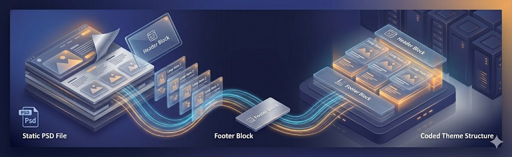
2. Breaking Down a PSD into WordPress Template Parts
WordPress uses a template hierarchy to determine which PHP file renders each URL. Understanding this hierarchy is essential for planning your theme’s file structure.
Start by identifying the distinct page types in your PSD. Most projects include: homepage, standard interior page, blog listing archive, single blog post, product or service page (custom post type), search results, and 404. Each needs its own template file or a suitably flexible shared template.
Template Parts Architecture
WordPress’s get_template_part() function lets you split templates into reusable components. I organize template parts into a logical directory structure:
theme-name/
├── style.css           # Theme header + global styles
├── functions.php       # Theme setup, hooks, custom functions
├── index.php           # Fallback template
├── front-page.php      # Homepage
├── single.php          # Single post
├── page.php            # Static page
├── archive.php         # Post archive
├── search.php          # Search results
├── 404.php             # Not found page
└── template-parts/
    ├── global/
    │   ├── header.php
    │   ├── footer.php
    │   └── navigation.php
    ├── content/
    │   ├── content-post.php
    │   ├── content-page.php
    │   └── content-none.php
    └── components/
        ├── hero.php
        ├── cta-banner.php
        └── card-post.php
This structure means that when I need to update the footer, I change one file and it updates across every page. When I build the blog card component once, it works in the archive, the homepage featured posts section, and the related posts sidebar.
3. Converting PSD Typography to WordPress Theme Styles
Typography is where PSD-to-WordPress conversions most commonly go wrong. Developers transcribe exact pixel values from the PSD without thinking about how they scale, how they’ll behave when a user changes browser font size, or how they’ll adapt to smaller screens.
The correct approach is to define a type scale using relative units (rem) and CSS custom properties, then map PSD values to the nearest point on that scale rather than blindly copying pixel values.
/* Typography scale */
:root {
  --text-xs:   0.75rem;   /* 12px */
  --text-sm:   0.875rem;  /* 14px */
  --text-base: 1rem;      /* 16px */
  --text-lg:   1.125rem;  /* 18px */
  --text-xl:   1.25rem;   /* 20px */
  --text-2xl:  1.5rem;    /* 24px */
  --text-3xl:  1.875rem;  /* 30px */
  --text-4xl:  2.25rem;   /* 36px */
  --text-5xl:  3rem;      /* 48px */

  --font-weight-normal: 400;
  --font-weight-medium: 500;
  --font-weight-semibold: 600;
  --font-weight-bold: 700;
  --font-weight-extrabold: 800;

  --line-height-tight: 1.25;
  --line-height-snug: 1.375;
  --line-height-normal: 1.5;
  --line-height-relaxed: 1.7;
}

/* Register Google Fonts via WordPress */
For font loading, register fonts in functions.php using wp_enqueue_style() rather than hardcoding <link> tags in header.php. This gives WordPress full control over the resource loading order and allows plugins to dequeue fonts if needed.
4. Image Handling: From PSD Assets to WordPress Media
Images in a WordPress theme fall into two categories: theme images (decorative elements, background textures, icon sets) and content images (photos, featured images, post thumbnails). Each is handled differently.
Theme images live in the theme’s /assets/images/ directory and are referenced via CSS or PHP with get_template_directory_uri(). These images are part of the codebase and don’t change per deployment.
Content images are uploaded through the WordPress media library and associated with posts or pages via custom fields or the add_theme_support('post-thumbnails') feature. For each featured image context in the PSD design, register a custom image size:
// In functions.php
add_image_size( 'card-thumbnail', 400, 280, true );   // crop
add_image_size( 'hero-image', 1440, 600, true );      // crop
add_image_size( 'team-portrait', 300, 380, true );    // crop

// Output responsive image in template
the_post_thumbnail( 'card-thumbnail', [
    'loading' => 'lazy',
    'sizes'   => '(max-width: 768px) 100vw, 400px',
] );
Always include loading="lazy" on below-the-fold images and configure sizes attributes correctly so browsers download appropriately sized images for each viewport. WordPress automatically generates srcset attributes for registered image sizes.
5. Responsive Conversion: Making PSD Designs Mobile-Ready
PSDs almost always show only one viewport. Your job is to extrapolate a complete responsive design. This requires judgment and design sensibility, not just CSS media query mechanics.
My standard breakpoint system maps to real device categories:
- sm: 640px — large phone landscape
- md: 768px — tablet portrait
- lg: 1024px — tablet landscape / small laptop
- xl: 1280px — desktop
- 2xl: 1536px — large desktop
Design mobile-first: start with the smallest viewport styles as the default, then add breakpoints for larger screens using min-width media queries. This produces smaller CSS and cleaner overrides than desktop-first approaches.
Common PSD-to-mobile adaptation patterns: multi-column grids collapse to single column, horizontal navigation becomes a hamburger menu, oversized hero text scales down using clamp(), sidebars stack below main content, data tables scroll horizontally with overflow-x: auto.
6. Testing Your Converted PSD WordPress Theme
Thorough testing prevents post-launch embarrassments. My testing checklist for every PSD-to-WordPress conversion:
- Content variation testing: Test with very short titles (one word), very long titles (200 characters), posts with no featured image, posts with multiple categories, empty pages.
- Cross-browser testing: Chrome, Firefox, Safari, Edge. Use BrowserStack for Safari on iOS and macOS if you don’t have Apple hardware.
- Device testing: iPhone SE (375px), iPhone 14 Pro (393px), iPad Air (820px), standard 1080p laptop, 1440p desktop.
- WordPress-specific testing: Admin bar visibility when logged in, Gutenberg editor rendering in the block editor, widgets in all registered sidebar areas, custom menu items including dropdowns.
- Accessibility testing: Tab navigation through the page, screen reader test with NVDA or VoiceOver, color contrast audit with the axe browser extension.
- Performance testing: Lighthouse audit, PageSpeed Insights, Core Web Vitals field data after 2+ days of live traffic.
PSD to WordPress theme conversion is an architectural discipline. The key decisions — what becomes a template part, what becomes a dynamic PHP call, what becomes a Gutenberg block — determine whether the theme is maintainable and client-friendly for years to come. Never treat it as a pixel-copying exercise.
Frequently Asked Questions
Export assets from the PSD, write semantic HTML5, write CSS matching the PSD styles, create mandatory WordPress theme files (style.css with theme headers, index.php, functions.php), split the HTML into template parts (header.php, footer.php, etc.), register menus and widget areas, and add Gutenberg block support for editable content areas.
A WordPress theme requires at minimum style.css (with theme header comments) and index.php. A production theme also needs: functions.php, header.php, footer.php, single.php, page.php, archive.php, search.php, 404.php, and optionally a screenshot.png (880×660px) for the Appearance > Themes admin screen.
Yes. Photoshop has been used to design WordPress themes for many years and remains viable in 2026. While Figma is now the industry standard for new design work, Photoshop PSD designs are fully convertible to WordPress. The conversion process is identical regardless of whether the source file is PSD, Figma, Sketch, or Adobe XD.
The PSD is a fixed-width desktop design, so responsiveness is something you build, not extract. Use a fluid layout (CSS Grid/Flexbox with relative units), then add breakpoints with media queries — typically around 1024px, 768px, and 480px — collapsing multi-column sections into single columns and scaling type with rem/clamp(). Test on real devices, not just the browser’s responsive mode. If the PSD only shows desktop, you’re designing the mobile experience yourself, which takes judgment beyond mechanical conversion.
A simple single-template brochure PSD can become a working theme in a few days. A typical multi-page business site runs one to three weeks, depending on the number of unique templates, custom post types, and how much dynamic or editable content is needed. The biggest time drivers are interactive states the PSD doesn’t show, responsive behavior, and turning static sections into editable blocks — clarify those up front and the estimate holds.
Automated PSD-to-HTML/WordPress converters can scaffold quickly, but they produce bloated, non-semantic markup that’s hard to maintain and rarely matches the design pixel-for-pixel. For anything beyond a throwaway page, hand-coding (or a developer-built theme) gives clean semantic HTML, a proper WordPress template structure, editable blocks, and performance you control. Use automation for a rough starting point at most; ship production sites with hand-built code.
Less common than it once was — most new design work happens in Figma now — but still relevant. Plenty of enterprises, agencies, and legacy projects still deliver PSDs, and the underlying skill is identical regardless of source: slice assets, write semantic HTML, build WordPress templates, and add editable blocks. Whether the file is a PSD, Figma, XD, or Sketch, the conversion process is the same; only the asset-extraction step differs.
The best tools are: LocalWP for local development environment setup, VS Code with PHP Intelephense and WordPress Snippets for coding, Adobe Photoshop for asset extraction and layer inspection, Git for version control, and WP-CLI for WordPress management. There is no automated tool that reliably converts PSDs to production-quality WordPress themes — professional manual development is required.